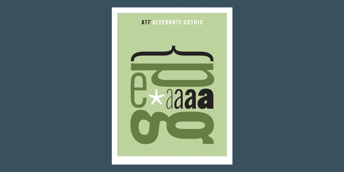
Alternate Gothic
By Morris Fuller Benton, Mark Van Bronkhorst, Alan Dague-Greene, David Sudweeks, Igino Marini & Ben Kiel
?8de7)
?a19a)
?fe0f)
?4bcc)
?e80b)
?4589)
?a733)
?372d)
?022e)
?7f67)
?d39c)
?8ce1)
?f2a6)
?7cb9)
?92ff)
?fe96)
?57d5)
?0c97)
?3530)
?1775)
?ea01)
?3bf1)
?2ef0)
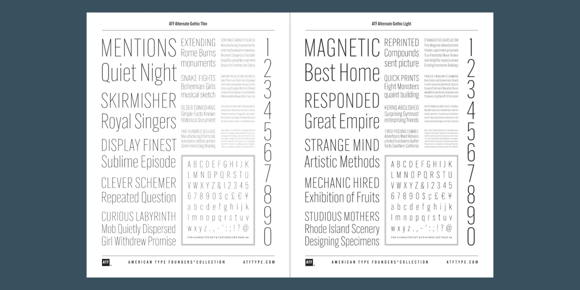
Alternate Gothic Thin
Alternate Gothic Light
Alternate Gothic Semi Light
Alternate Gothic Book
Alternate Gothic Regular
Alternate Gothic Medium
Alternate Gothic Demi
Alternate Gothic Bold
Alternate Gothic Heavy
Alternate Gothic Black
Information
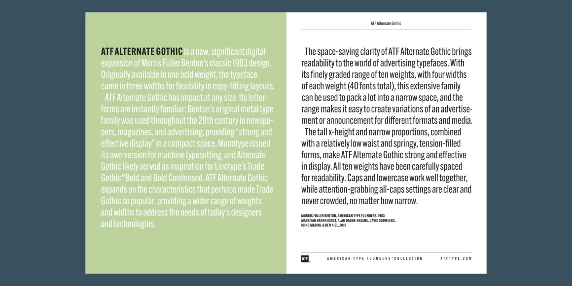
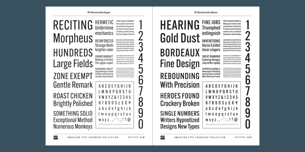
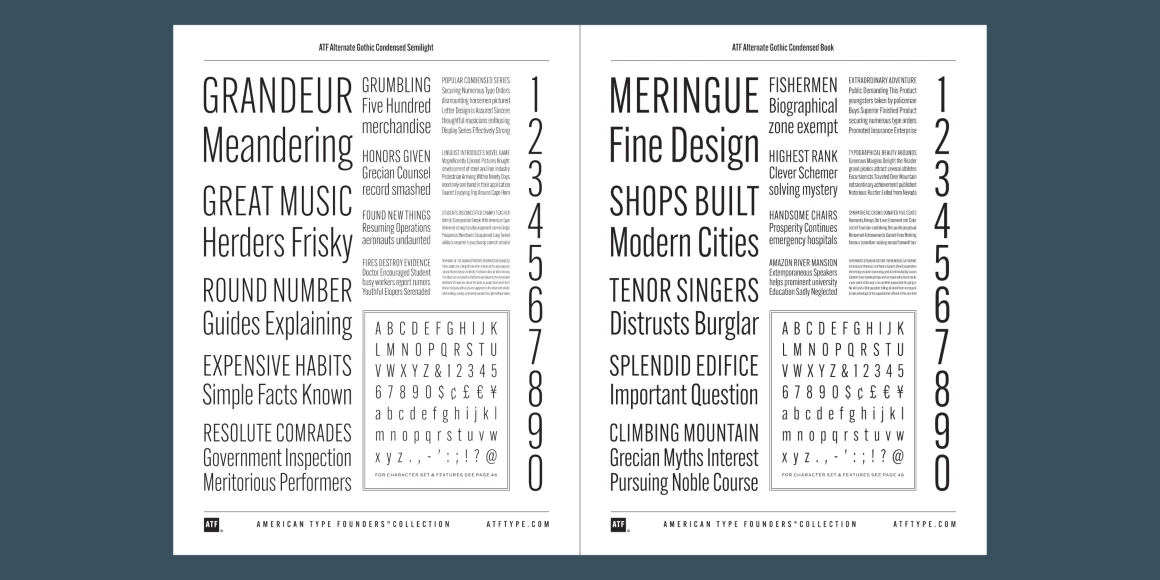
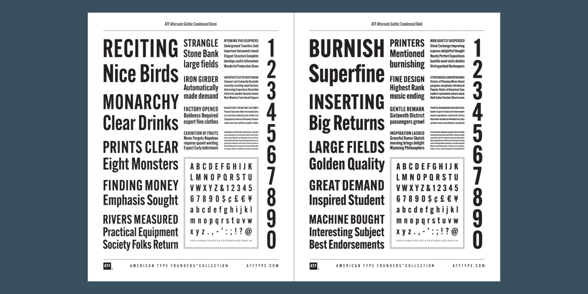
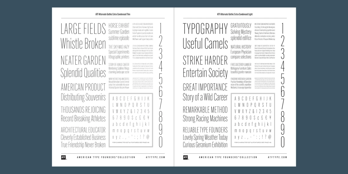
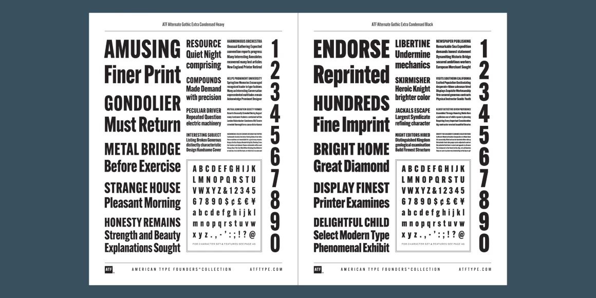
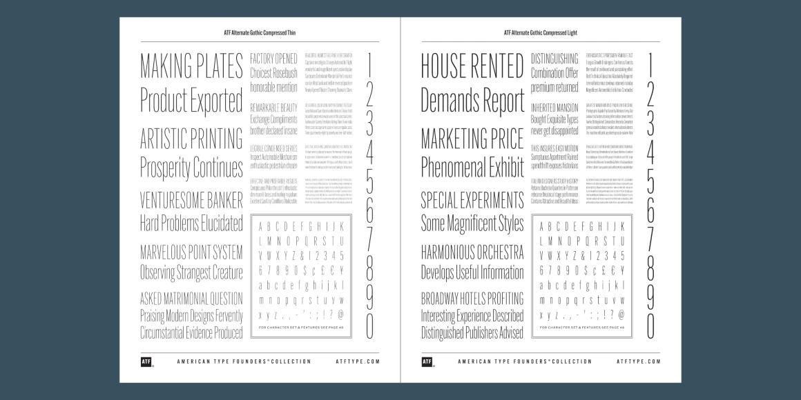
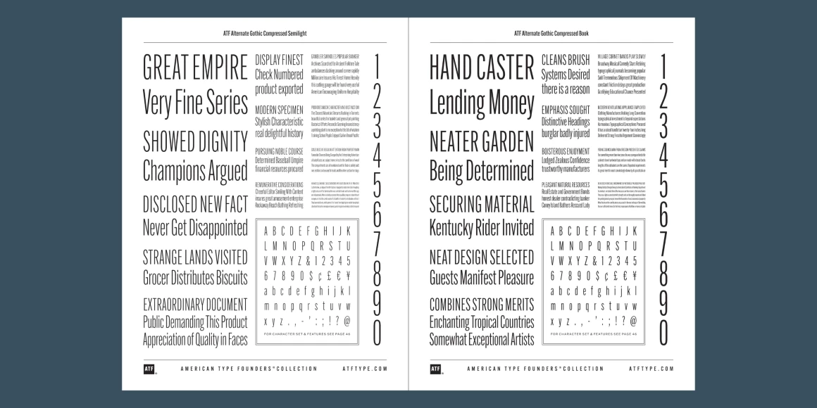
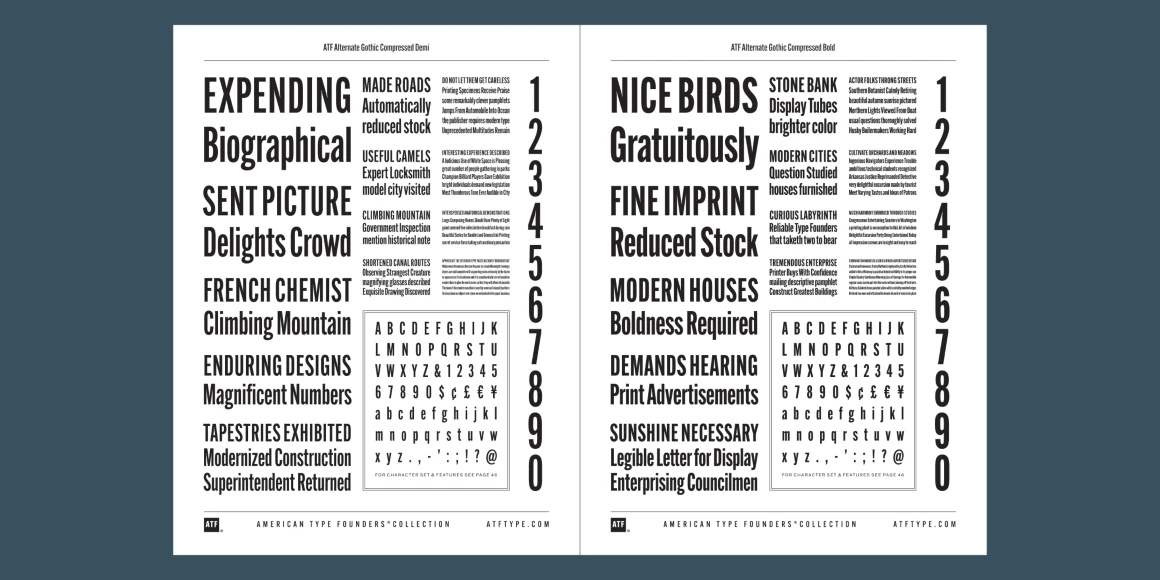
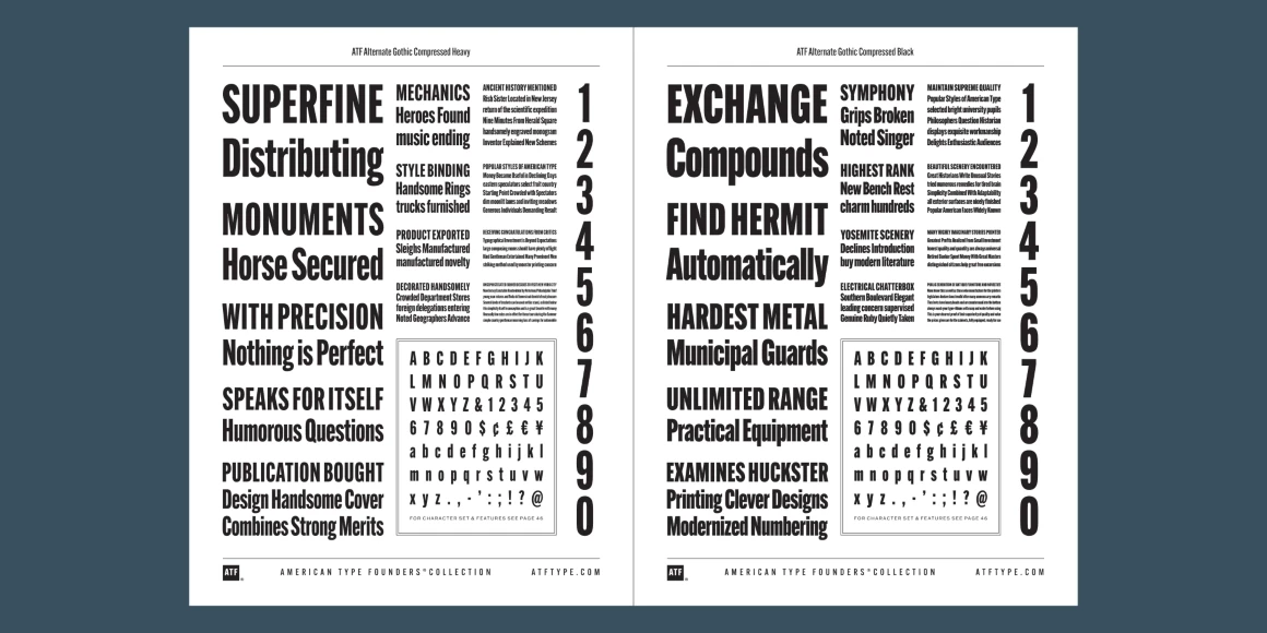
ATF Alternate Gothic is a new, significant digital expansion of Morris Fuller Benton’s classic 1903 design. Originally available in one bold weight, the typeface came in three widths for flexibility in copy-fitting layouts.
ATF Alternate Gothic has impact at any size. Its letterforms are instantly familiar: Benton’s original metal type family was used throughout the 20th century in newspapers, magazines, and advertising, providing “strong and effective display” in a compact space. Monotype issued its own version for machine typesetting, and Alternate Gothic likely served as inspiration for Linotype’s Trade Gothic® Bold and Bold Condensed. ATF Alternate Gothic expands on the characteristics that perhaps made Trade Gothic so popular, providing a wider range of weights and widths to address the needs of today’s designers and technologies.
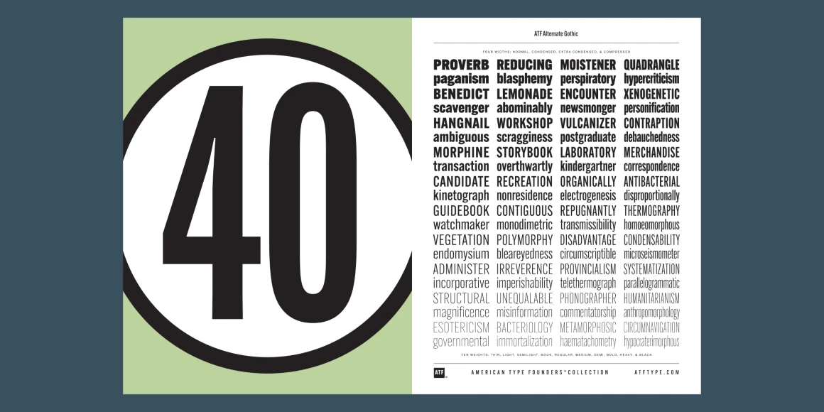
The space-saving clarity of ATF Alternate Gothic brings readability to the world of advertising typefaces. With its finely graded range of ten weights, with four widths of each weight (40 fonts total), this extensive family can be used to pack a lot into a narrow space, and the range makes it easy to create variations of an advertisement or announcement for different formats and media.
The tall x-height and narrow proportions, combined with a relatively low waist and springy, tension-filled forms, make ATF Alternate Gothic strong and effective in display. All ten weights have been carefully spaced for readability. Caps and lowercase work well together, while attention-grabbing all-caps settings are clear and never crowded, no matter how narrow.
Language Support
- Catalan
- Croatian
- Czech
- Danish
- Dutch
- English
- Filipino
- Finnish
- French
- Fula
- German
- Hungarian
- Indonesian
- Italian
- Latvian
- Malay
- Maltese
- Norwegian
- Polish
- Portuguese
- Romanian
- Slovak
- Slovenian
- Spanish
- Swedish
- Turkish
Licensing with Typographer
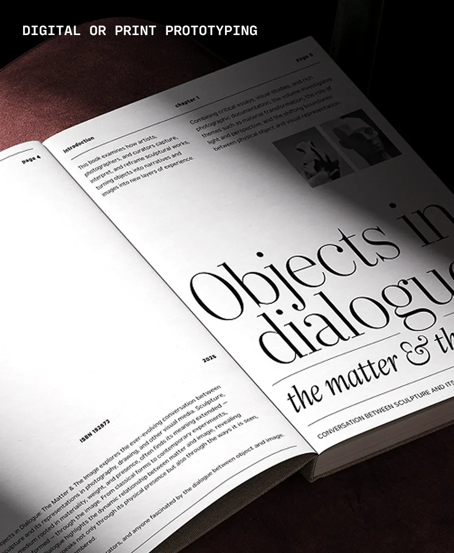
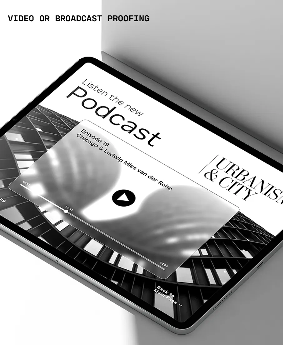
Typographer covers web use (up to 15K pageviews / month) and unlimited prototyping. Learn more in our FAQ.
Need to buy a license?
Visit American Type Founders Collection
Similar fonts
-
Block Gothic
Red Rooster Collection
10 styles -
Big Shoulders
XO Type Co
28 styles -
Royal Street
XO Type Co
6 styles -
Flexoplex
Typetanic Fonts
21 styles -
Karantina
Google Fonts
3 styles -
Revla Sans Text
Dave Rowland Type
4 styles -
Pathway Gothic One
Google Fonts
1 style -
Clydesdale
Red Rooster Collection
5 styles -
Big Shoulders Stencil
XO Type Co
28 styles -
IvyGrotesque
Ivy Foundry
43 styles