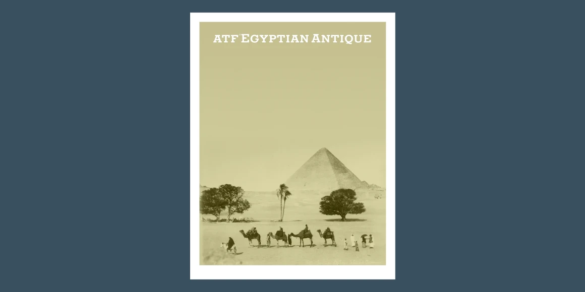
Egyptian Antique
By William Schraubstädter, Mark Van Bronkhorst, Igino Marini & Ben Kiel
?e6fd)
?4204)
?5af5)
?26c2)
?0cdd)
?db20)
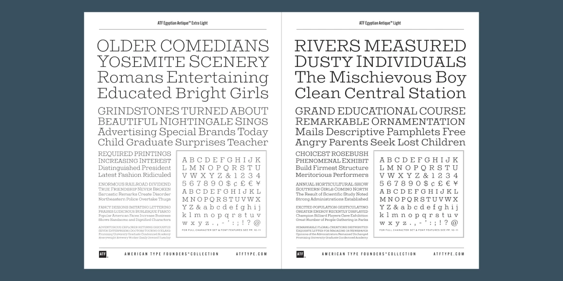
Egyptian Antique Extra Light
Egyptian Antique Light
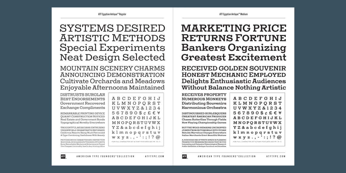
Egyptian Antique Regular
Egyptian Antique Medium
Egyptian Antique Bold
Egyptian Antique Heavy
Information
Litho Antique was issued in 1910 by the Inland Type Foundry of St. Louis, Missouri. Established in the mid-1890s by William Schraubstädter and his brothers, Oswald and Carl, Jr., the independent foundry emerged from a family rooted in typographic tradition.
Inland, well known for the quality of its type as well as its innovations in manufacturing, advertised Litho Antique as the “newest typeface; one of our best; closely imitating steelplate and lithography.” Just a year after Litho Antique’s release, the Schraubstädter brothers sold their foundry to American Type Founders in 1911. The type makes what may be its first significant appearance in the 1912 American Type Founders specimen book.
A slab-serif metal typeface initially available in a single medium weight, Litho Antique sprang from a long line of 19th-century “Egyptian” typefaces used widely in Victorian printed ephemera. Egyptian styles were typically slab-serif, and had no real connection to Egypt. Napoleon’s Egyptian campaign led to a craze for Egyptian-themed furniture and decorative goods during the Victorian era. The Egyptian theme somehow became associated with the slab-serif typefaces of the time, and the name stuck.
With the advent of Modernism in the mid-1920s, and the 1927 release of Paul Renner’s Futura, typefaces based on geometric forms came into widespread use. In 1931, ATF’s Morris Fuller Benton used Litho Antique as the model for his new Rockwell typeface. But Rockwell was a new design, deliberately modern, without the period flavor of Litho Antique.
ATF Egyptian Antique is an expansion of Schruabstädter’s design to six weights. A new feature is the addition of small caps, essential for headings and useful as alternative capitals in upper-and-lowercase settings. The x-height has been slightly increased to better balance with the caps, and while some letterforms have been refined, the family stays true to the eccentricities and antique quality of Schraubstädter’s Egyptian gem.
Language Support
- Catalan
- Croatian
- Czech
- Danish
- Dutch
- English
- Filipino
- Finnish
- French
- Fula
- German
- Hungarian
- Indonesian
- Italian
- Latvian
- Malay
- Maltese
- Norwegian
- Polish
- Portuguese
- Romanian
- Slovak
- Slovenian
- Spanish
- Swedish
- Turkish
Licensing with Typographer
Typographer covers web use (up to 15K pageviews / month) and unlimited prototyping. Learn more in our FAQ.
Need to buy a license?
Visit American Type Founders Collection
Similar fonts
-
Coustard
Google Fonts
2 styles -
Freight Micro
Freight Collection
12 styles -
BioRhyme
Google Fonts
1 style -
Peralta
Google Fonts
1 style -
Vale
P22 Type Foundry
1 style -
Faust
Red Rooster Collection
6 styles -
Trocchi
Google Fonts
1 style -
Corben
Google Fonts
2 styles -
Inknut Antiqua
Google Fonts
7 styles -
Charcuterie Serif
Laura Worthington Design
2 styles