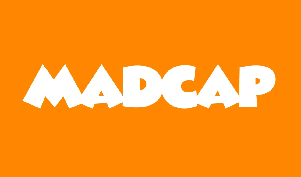
Madcap
By Mark Simonson
?bc36)
?2b9b)
?ebba)
?4ec1)
Madcap Black
The quick brown fox jumps over the lazy dog
Information
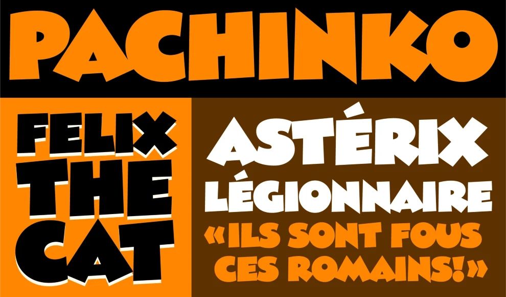
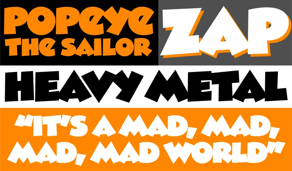
Madcap (2024) has its roots in a style of lettering that its designer, Mark Simonson, used frequently when he was in high school in the early seventies. He was inspired by comic book and greeting card lettering from the sixties. Madcap’s lively appearance comes from its skewed geometry, which avoids anything aligning to a square axis or grid, yet does so with a rhythmic and consistent logic. It’s an all-caps design, and features an alternate lowercase-style “E” and a full set of dingbats.
Language Support
- Catalan
- Croatian
- Czech
- Danish
- Dutch
- English
- Filipino
- Finnish
- French
- Fula
- German
- Hungarian
- Indonesian
- Italian
- Latvian
- Malay
- Maltese
- Norwegian
- Polish
- Portuguese
- Romanian
- Slovak
- Slovenian
- Spanish
- Swedish
- Turkish
Licensing with Typographer
Typographer covers web use (up to 15K pageviews / month) and unlimited prototyping. Learn more in our FAQ.
Need to buy a license?
Visit Mark Simonson Studio
Similar fonts
-
Smashing
PintassilgoPrints
1 style -
Cachalote
PintassilgoPrints
1 style -
Season Times Sans
Vintage Voyage Design
1 style -
Messe Grotesk
Red Rooster Collection
1 style -
Sigmar One
Google Fonts
1 style -
Sigmar
Google Fonts
1 style -
Rubik Spray Paint
Google Fonts
1 style -
Opake
&DISCOVER
1 style -
Rammetto One
Google Fonts
1 style -
Jumble
Laura Worthington Design
1 style