Proxima Sera
By Mark Simonson
Proxima Sera Thin
Proxima Sera Thin Italic
Proxima Sera Extra Light
Proxima Sera Extra Light Italic
Proxima Sera Light
Proxima Sera Light Italic
Proxima Sera Regular
Proxima Sera Regular Italic
Proxima Sera Medium
Proxima Sera Medium Italic
Proxima Sera Semi Bold
Proxima Sera Semi Bold Italic
Proxima Sera Bold
Proxima Sera Bold Italic
Proxima Sera Extra Bold
Proxima Sera Extra Bold Italic
Proxima Sera Black
Proxima Sera Black Italic
Information
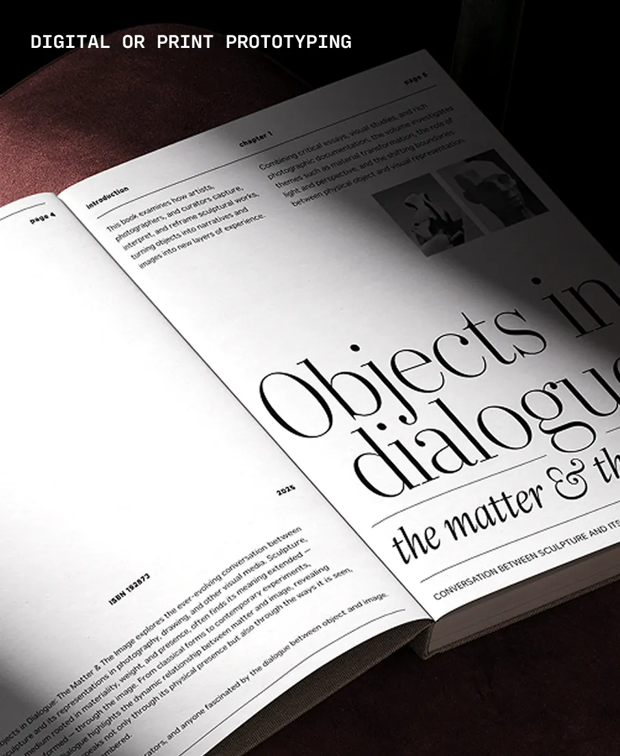
Proxima Sera (2022) answers the question that designers and typographers have asked for more than fifteen years — what serif typeface should I pair with Proxima Nova? Proxima Sera is a hybrid design, combining characteristics of old style and modern serif typefaces into something new that is clean and highly readable. While its proportions and range of weights are designed to harmonize with Proxima Nova, it stands alone just as well. Its even color and large x-height make it a logical choice for text settings, but Proxima Sera still has enough warmth for display use — especially Thin and Black. Try those in headlines, posters, or anywhere else you need to bring some fresh personality.
Language Support
- Catalan
- Croatian
- Czech
- Danish
- Dutch
- English
- Filipino
- Finnish
- French
- Fula
- German
- Hungarian
- Indonesian
- Italian
- Latvian
- Malay
- Maltese
- Norwegian
- Polish
- Portuguese
- Romanian
- Slovak
- Slovenian
- Spanish
- Swedish
- Turkish
- Vietnamese
Licensing with Typographer
Typographer covers web use (up to 15K pageviews / month) and unlimited prototyping. Learn more in our FAQ.
Need to buy a license?
Visit Mark Simonson Studio


Similar fonts
-
Tinos
Google Fonts
4 styles -
Mackinac
P22 Type Foundry
8 styles -
Georgia Pro
Carter & Cone
20 styles -
PT Serif
Google Fonts
4 styles -
PT Serif Caption
Google Fonts
2 styles -
Charis SIL
Google Fonts
4 styles -
Lisu Bosa
Google Fonts
16 styles -
Vesterbro
Black[Foundry]
14 styles -
Volkhov
Google Fonts
4 styles -
Richmond Text
Carter & Cone
12 styles
?19dc)
?a01d)
?30b1)
?f783)
?be16)