Citrine
By Patric King
?11a7)
?4bab)
?7bca)
?9d3e)
Citrine Variable
Citrine Light
Citrine Regular
Citrine Medium
Citrine Semi Bold
Citrine Bold
Information
Citrine draws upon the machine-driven typography of the first American PC boom of the 1980s: word processing typefaces made for easy reading at low resolution, and in-game typography. A large x-height means easy onscreen reading; a round joint means friendliness. Citrine is a typeface for writing, loosely based on the Epoca typeface (made for the Hermes 3000 typewriter). Citrine starts with Epoca’s essential widths and spaces, then adds tension with flat sides in curved forms, a double-barrel lowercase a and the tighter spacing necessary for modern screen reading. Citrine is five weights + true small caps for each, sized to the lowercase. You can set that as unicase, if you’re one of those people.
Language Support
- Catalan
- Chinese Pinyin
- Croatian
- Czech
- Danish
- Dutch
- English
- Filipino
- Finnish
- French
- Fula
- German
- Hungarian
- Indonesian
- Italian
- Latvian
- Malay
- Maltese
- Norwegian
- Polish
- Portuguese
- Romanian
- Slovak
- Slovenian
- Spanish
- Swedish
- Turkish
- Vietnamese
Licensing with Typographer
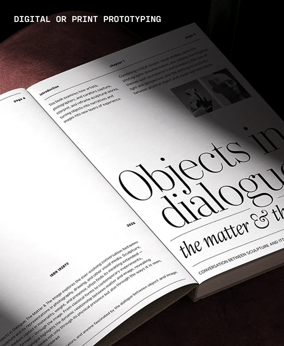
Typographer covers web use (up to 15K pageviews / month) and unlimited prototyping. Learn more in our FAQ.
Need to buy a license?
Visit XO Type Co

Similar fonts
-
Space Grotesk
Google Fonts
1 style -
Mooli
Google Fonts
1 style -
Ampere
Black[Foundry]
7 styles -
Metrophobic
Google Fonts
1 style -
Maven Pro VF Beta
Google Fonts
1 style -
Maven Pro
Google Fonts
1 style -
Galix Mono
Dave Rowland Type
12 styles -
Sora
Google Fonts
1 style -
Fustat
Google Fonts
1 style -
Tosh A
Black[Foundry]
7 styles